What I love about using Home Assistant is that it gives a lot of insight.
As mentioned before one of my main goals was to monitor energy usage.
I’ve been using the system since the end of June last year and I really like the insights in my energy usage/production. I recorded my monthly consumption via Excel already, but now I have a more granular insight that I did not have before. And it’s automated!
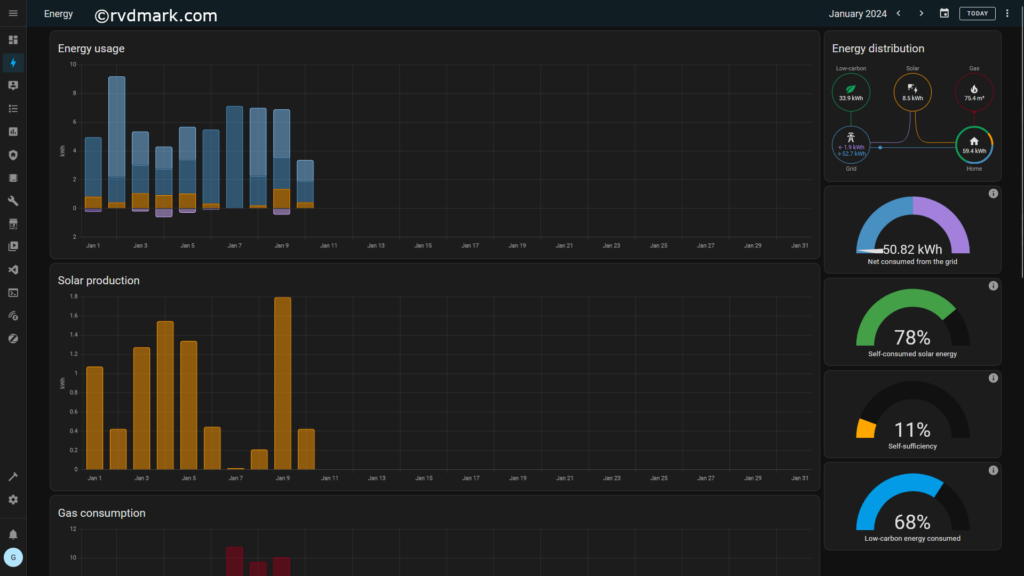
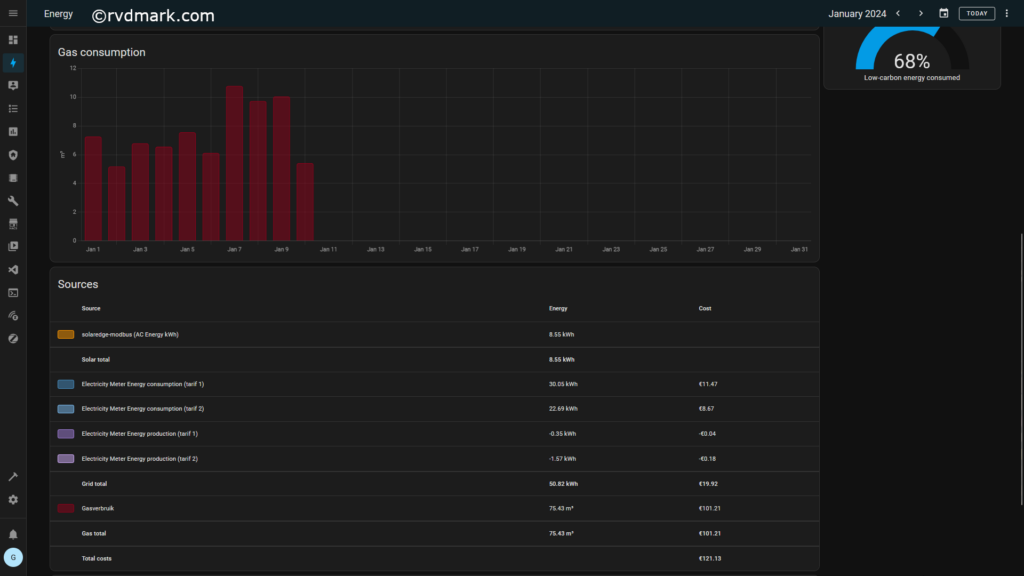
The useful insight for me is definitely the energy dashboard. I use it to keep an eye on (live) energy consumption but it can also be an indicator how effective and energy saving measure is. Or how much power something uses via the live power meters and the usage graph showing me power consumption and production combined in one graph.
This is why I incorporated elements of the energy dashboard in my own dashboard. And combined it with elements I was missing there.
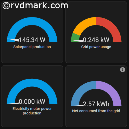
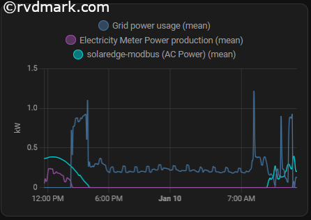
You can also click on entities and see more recent history. Home Assistant provides a lot of insight, everything is logged.
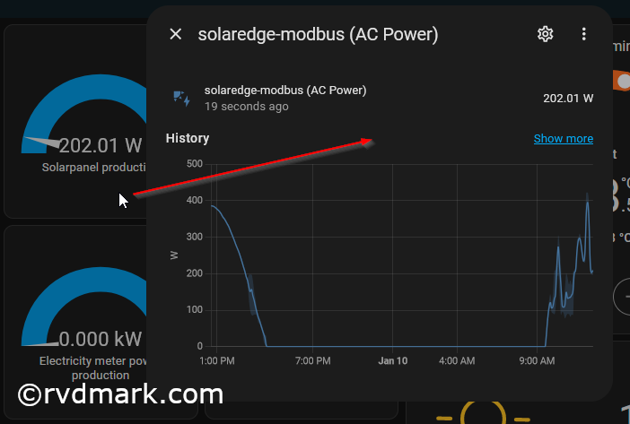
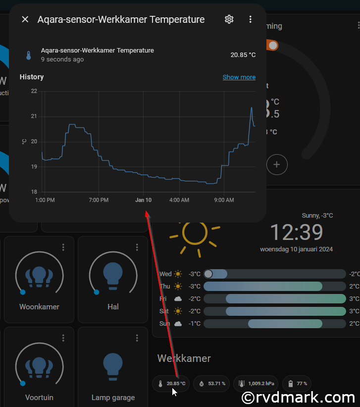
And if you then click on more you can dive into the logs over time. Like with temperature sensors, if you click on them you can often see details over time. Love it!


I love the amount of insight I get. Some very useful and practical, others just nerdy and nice-to-have.
When it comes to the energy dashboard, and it’s ability to compare current with historic values, that is definitely one of the most useful aspects of Home Assistant to me.
My current Excel solution already gives me a nice insight, and allows me to quickly see the real world financial impact when I need to change or renew my energy contract.
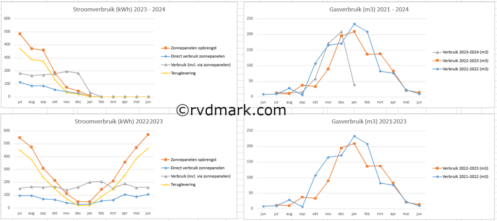
In the screenshot below you can see the graphs generated in my Excel sheet. Power usage/production on the left, gas usage on the right.
Energy legend
- orange: solar panels
- yellow: power production, excess power sold to the grid
- grey: power usage (grid and solar combined)
- blue: power usage (solar power only)
